And again I am glad to welcome you!
In today's article we will talk exclusively about the VKontakte group, although for the most part, I prefer to work with public pages. But when in the last article I touched on the example of my public, many had questions, specifically about the menu for the group.
How to create a menu in a VKontakte group
Here's what I got.
I made the menu as an example only. In order to understand it for groups, to consider in more detail all the subtleties for you.
So. Here are the basic steps:
- Think over the main menu
- Select image
- Photoshop (nowhere without Photoshop, as always 🙂)
- Image cutting
- Uploading an image to a contact's album
To activate Recent Entries(for your future menu), you need to go to the community management and enable the item - “Materials”
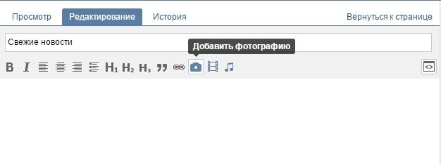
After the materials are included, the “Latest News” item will appear at the top of the group, in which you will need to create a menu. Just like with any contact page, we find ourselves in an editor in which we can either manually upload images or menu buttons, or through wiki markup (button in the upper right corner).
As you guessed, the easiest way is to first draw the necessary picture in Photoshop and place buttons on it in advance; in the future they will be links.
In my example, I used a girl's background and placed 3 buttons to the left of her. Each button had its own name.
My menu consisted of the following items:
To integrate the finished image into contact, it must first be cut out. To do this, we use the “Cutting” tool in Photoshop. I think there will be no difficulties with this. Everything is simple there... Just in case, I took a photo :)
We select this tool and start “cutting”. I got 4 parts. (the simplest thing I came up with :), although you can cut it into pieces)
All necessary work to create the menu has been completed. Now you can start creating a VKontakte menu. To do this, upload images to the contact one by one. Here's what we ended up with:
Now click on each button (or part of the image) and assign the required address (link). To remove extra spaces you need to use the “nopadding” tag (in the Wiki markup menu)
The “nopadding” tag removes spaces between images, that is, it helps to “join” them closely to each other.
As a result of adding the tag, the result was the following:
It seems that everything is clear and there is nothing complicated. And if you suddenly decide to create it yourself, then go for it, you’ll probably end up making it more beautiful... In my example, it didn’t turn out as cool as I would like, but I looked at the working part for you. Surely, if you spend more time, and even turn to freelancers, you can create a very cool menu.
I saw many people making a continuation of the main avatar. It turns out as one whole image. Looks good. But to create something like this, you need to have a better understanding of Photoshop :)
I also noticed that many people are interested in the question - how to make the group menu open, that is, so that the VKontakte group menu is open initially when entering the group.
Answer: As far as I know, this feature was removed by Vkontakte administrators. Previously, there was a separate button to make the menu fixed - open. Then this function was removed, and now the menus have to be opened separately.
Although, I have seen some that are open by default... and someone even said that there is some code that copes with this problem. But I wouldn't recommend using it. Judging by the discussions on many forums, the admins do not welcome this!
That's all for today. See you in touch!
The goal of the creator of a group on social media. networks to attract more visitors. It is important that the guest wants to join, sign, read information, leave a comment or order a product. The need for the final result differs from the direction of activity.
The first seconds of the stay shape the guest’s further actions. This is why the interface plays a big role.
Factors that leave a guest:
- avatar;
- description;
- Name;
- beautiful and practical menu;
- colorfulness;
- content.
It’s easy to create a practical menu that motivates more than just action. But first you need to figure out what it should be.
What should the menu be like?
Using a well-designed menu, the visitor can easily navigate through it and quickly get answers to their questions.
Navigation also allows you to create the right impression of the project.
- Three main goals of groups:
- sales;
- increase in traffic;
increase in active visitors.

For sales, group navigation replaces in-store display.
- The most important buttons should be here:
- catalog;
- price;
- delivery;
- promotional offers;
To increase traffic, the emphasis is on the content and flavor of the site or blog.
An approximate set of buttons:
- interesting articles;
- helpful information;
- subscribe;
- promotional offers;
To increase the activity of participants, you should stimulate them with promotions, surveys and interesting and unusual content.
We offer the following buttons:
- subscribe to news;
- ask an interesting thematic question;
- stock;
- questionnaire;
- vote.
Let's look at how to create a menu for a VKontakte group, all the technical aspects that require minimal knowledge of a graphic editor and the basics of working with VKontakte.
We create in stages
Creating navigation is an interesting, complex and lengthy process. But the result is worth it.
The whole process is divided into 2 stages:
- working with photoshop;
- technical addition.
video: menu for public
Working with Photoshop
Before you begin, you need to visualize the design or overall appearance, as well as its components. No special knowledge is required, just follow the steps of the instructions.
Algorithm of actions:


This is done using the Rectangular Marquee tool:

Working with graphics:

It should look something like this:
Save the rectangle located on the right as a separate image, setting the size to 200x500 pixels. This is a ready-made avatar, uploaded through the “Upload photo” button in the VK group.

The second picture still needs to be divided by the number of points. This is done in order to assign a link to each button.
First you need to make the markup:

Create fragments:

Saving images:
- click File – Save for web;

- Enter the title;
- specify the JPEG format;
- set the best quality;
- check the boxes for “Progressive and Built-in profile”;
- The last button is “Save”.
- go to the group;
- turn on the news feed;

- next to the “Latest News” bar, click “Edit”;
- change the name to a menu or something similar;
- add pictures using a button in the form of a camera;
- the result will be something like this:
- find the required entry;
- left-click on it;
- copy the URL in the address bar.
How to clean your computer from unnecessary programs? Instructions here.
Technical part
Finished images must be transferred to the group. By following the steps below, this task can be easily completed.
Important! Uploading a menu differs from usually uploading photos or pictures.
Everything in order:
Now the most important thing is why all this was done. Add menu functionality. A separate image must be assigned its own link.
- go to the source where you need to transfer the visitor;
- copy the required address.

Save the changes using the corresponding button at the bottom of the window.
Attention! Changes may not be reflected immediately. It is recommended to log out to your main profile and then log back into the group.
How to create a menu in a VKontakte group wiki markup
Wiki markup is a special language used to design web pages in social network groups.
This tool allows you to create:
- effects;
- unusual menus;
- signs;
- navigation elements;
- format text.
In a word, this markup allows you to create a mini VKontakte website. This is very convenient, especially for sales and recruiting subscribers.
This design intuitively forces the visitor to stay and click on the button. That is, it delays and stimulates action - and this is exactly what is needed.
Visually, such a system is very similar to HTML layout. But it does not require long training and a special mindset.
Video: menu with search by category
Nuances of creation
Actually, what was done above (dividing and loading the image) are already markup elements. This is the advantage of this tool. Automatic conversion into tags when simply loading images.
However, it is important to know the individual tags to help add even more functionality and beauty. For example, when we fill individual parts of the image, white stripes may form between them. You can remove them by simply adding the noborder tag.
Like this: []
The main tags are presented in the table below:

Working with pictures
[] .
Where options is replaced with:
- noborder- removing the frame around the image;
- nopadding- removing spaces between images;
- plain- insert a link to the image. Designed as text, without graphics;
- nolink- removing the link to the picture;
- box- opening an image in a window;
- NNNxYYYpx or NNNpx- sets the photo size in pixels.
Creating a table
Regardless of what kind of menu (text or graphic) you create, you are unlikely to do without inserting a table. Otherwise, you can just paste the text into the news field and not format it, wasting so much time.
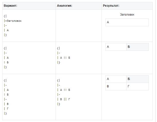
A table is created using a special set of characters, where each of them is responsible for a specific part of the table:

In this article I will tell you how to beautifully design a group in contact. Agree, the more beautiful the group, the more pleasant it is to subscribe to it. At the same time, the group will have a convenient menu that you just want to go to and view its contents.
Less talk, let's start creating menu for a group on VKontakte.
First, you need to actually create the group itself, as I wrote in a previous article.
And so, it all starts in Photoshop, we create a picture of the menu you want. Basically, this is some kind of background with the names of the headings. An acquaintance just asked me to make a beautiful group for his company aero-stomadent, which deals with industrial ventilation, so I’ll do it.
I found a wonderful background of Alaskan nature, and in fact, I will do everything on it.

We write the menu itself in the background. For example, I write about what the company does. These will be the buttons for which I will later make more pages. Each word will be a menu button in the future.

On the right, make this part the group's avatar in the future.
Now the mode is picture to small images. Select the "Cutting" function from the menu, then right-click on the canvas and cut so that each word is separate.


It is advisable to cut it approximately like this.

After cutting, we save the file, not just but through “Save for Web and devices...” (or Alt+Shift+Ctrl+S), it will create a folder with all the already cut files.


Now we are not going to the group yet, we still need to create a wiki markup. Or in other words, create a page.
How to create a Wiki page on VKontakte?
Open a new browser tab and paste the following link there: http://vk.com/pages?oid=-XXX&p=Name of page where XXX is your group ID. For example, this happened to me.
http://vk.com/pages?oid=-91934542&p=menu

Then click Fill with content. Here we see a very simple editor, select the camera function to add all our photos to the menu. It should turn out something similar to mine.

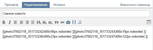
But there are spaces between the pictures, to remove the spaces - we enter the wiki markup mode (this is the quotation mark in the top right corner<>) enter the following tag "option;nopadding;" before photo sizes. For example []


And it all came together.

And so, all that remains now is to insert links into each button. Again, everything is done in wiki markup. We drive in previously prepared links to articles that you consider necessary.

Click save, see what happened, everything came together for me if you click it goes to the links "https://vk.com/page-91934542_49969122"

Then I go to the group and before that I make a picture that will be displayed for people in the group.

And I just post. I paste a link to the menu and add a photo that I just took.
Sales of goods or services. An excellent tool that simplifies working with a group is a menu created using wiki markup.
Recently, the number of public sites that use the wiki list has grown significantly. After all, this is a great way to give the group a more pleasant and aesthetic appearance, and also helps participants navigate all sections more easily.
In this article we will tell you how to make a VKontakte wiki page for a group, how to make a menu in a VK group, what types there are, how to create it and much more.
Creating a clickable wiki page is possible due to the fact that the VK text editor has the ability to use wiki markup. It allows you to insert pictures, links to them, videos and other elements using special commands.
The list allows you to create direct links to each category of product/service or to various sections/discussions of the community (for example, portfolio, how to order, about the company, etc.). Any user can find the necessary information by pressing just 1 button.
This solution is a navigator for ordinary visitors and serves as a beautiful and stylish design for the community. This is an interactive tool, using which, people will be happy.
Unfortunately, VK developers have not yet created the ability to post a wiki list on the main wiki page of the public (for now it is only available in a new tab). Therefore, people are forced to get sophisticated and create separate posts that lead to a menu page.
Basic commands and features of the wiki menu
The functionality of the wiki page is very wide. With its help you can make your menu visually pleasing, easy to read and structured.
Unfortunately, we won’t be able to fit absolutely all the teams into our material, so we’ll only talk about a few.
Making a menu using media files
This is done using special buttons.

In text form, media files are: [].
Where media XXXX_YYYY is the media file itself, options are various settings (for photos and videos), link is the inscription that will be displayed when you hover over the photo/video.
For photo options there are:

For video:
We create headings of different levels using == signs
Add "==" signs at the beginning and end of the title. See the screenshot for an example:

Working with title text to design a VKontakte group menu
You can also use the following text options: italic, bold or gray, strikethrough or underline, superscript or subscript. It is also possible to align text to the center or right. Below is a table with commands:

Using quotes to attract attention
Using a tag will allow you to beautifully design someone's quote.

Lists can be either numbered or bulleted.
For a numbered list, use the "#" symbol before each new item.

For a bulleted list, similar to the previous one, only with a “*” sign.

Working with indents
To indent, add a “:” sign before the word. Depending on the number of characters, the indentation will increase or decrease.

Internal links in the group menu
These are links to internal social resources. VKontakte network (link to person, community, discussion, application, page, video and image). They are added using the following construction: [].

External links in creating a VKontakte menu.

Wiki markup creates a table menu
Using the wiki page and markup, you can also create a table. See screenshot:

Informative spoiler
With its help, you can make information hidden or revealed with one click. Well suited if you need to create a section with “Frequently Asked Questions”.
A spoiler is created using the design:
((Hider|Spoiler name
Text
}}
And it will look like this:

Thus, the teams will help make a complete list with all the design elements.
Types of menu: what are they?
Wiki pages on VKontakte can be divided according to different criteria:
- Text (text only);
- Graphic (using images of buttons, backgrounds, etc.).
By display (depending on the image used):
- Z covered (the structure itself is not visible);

- Open (all items are visible at once);

- With an adjacent or common banner (can be either open or closed).

Regardless of the type you choose, they all work on the same principle.
Also, don't be afraid to combine these types. For example, you can first make a graphic part with buttons (background, style, design), and then supplement it with various text information (for example, “Frequently asked questions”, using spoilers).
How to create a text menu
Less popular and simpler is the text list on the wiki page. It does not contain any images or buttons. This is just a list of anchor links.
Below are step-by-step instructions on how to make a text list for a VK group:
- First you need to set up a community. To do this, go to “Community Management” and select the “Sections” section. Find the “Materials” line, select “Restricted” and save the settings.

- Next, “Latest News” will appear on the main page of the public. Go to them and click “Edit”.

- Enter the name.
- Below is the VK text editor. This is where we will create our list.
- Use the following construction:
Do all the necessary steps. Each new item is on a new line. Here you can use various commands that we talked about above.
For example, we will write a simple and small construction:

- Click save.
Here we have used “==” signs to highlight the heading and “*” signs to highlight the sub-clauses. As a result, we got the following:

Thus, having completed just a few steps, we received a completely understandable wiki menu, where each item will allow you to quickly go to the desired page.
You can add anything you want, as long as your imagination and wiki markup capabilities are sufficient.
How to create a graphical menu
To create a graphic menu, you need to have at least basic skills in working with graphic editors (such as Photoshop, GIMP, various applications, etc.). If you do not have them, then we can recommend using the help of professionals or resources (read more below).
Here we will talk about how to create a wiki page menu yourself. Below are step-by-step instructions:
- Follow steps 1-3 from the previous instructions.
- It is necessary to create blank images with buttons. We will not talk in detail about working in graphic editors, since there are many lessons on working with Photoshop and other programs on the Internet.
We will take the following images.

All three pictures are part of one big one. Therefore, when we create navigation, these images will look like one whole picture with buttons located on it.
- Upload images to the VKontakte text editor.

- By clicking on each picture, you can select options and provide a link.

- On the right there is a switch between visual and text editing modes.

- In text form, our images look like this:

- We change the inscription “noborder” to “nopadding” to remove the distance between the pictures and close them together. And after the “|” sign add a link.

- Click “Save Page”.
As a result, we got this menu:

With a little effort and ingenuity, you can create an original design that will fit into.
How to secure
In order for the created wiki menu to be displayed on the main page of the community, you must complete the following steps:
- Copy your menu link. To do this, go to edit again and copy the URL from the browser address bar.

First add an image, see the image below. 
Now publish and pin the post.
Here you will have to work hard on the image. After all, it will be constantly visible. It should also fit into the overall design of the public and tell users that by clicking, they will be taken to the menu.
How to delete
Removing a wiki menu is not a difficult task. Just go to “Community Management”, “Sections” section and turn off the materials.
It is important to remember that if you used a pinned post, it will remain. Therefore, it will also need to be deleted (or at least removed from the pinned ones).
Ready-made templates
We would also like to present to your attention services that will help you download ready-made templates or create new ones in just a few clicks.
- You-ps.ru is a service with ready-made wiki menu templates and other ready-made community design elements.

- Vkmenu.com is an online constructor. It allows you to easily and quickly create stylish menus.

Hiring a professional can also be considered a ready-made solution. In this case, you also do not have to do everything yourself, but you will have to pay.
Bottom line
We looked at what a wiki menu is in VKontakte communities. We learned how to create it and use various commands.
We believe that the menu has not yet been fully appreciated. For a lot of people, this “wiki markup” is something super complex and scary. They don't even want to take it on. But in reality, as we see, everything is quite simple.
Don't be afraid to experiment and be original!
Evgenia Kryukova 
*Updating the article.
Beautiful design of the VKontakte community is not a whim, but an important element that builds user trust in you and your company. If a public page or group is designed unprofessionally, your potential clients may quite logically conclude that you are equally negligent in your work. To prevent this from happening, make sure that your VKontakte page is beautiful, neat and easy to use. How to do it? Read below.
Current sizes of VKontakte images
Some time ago, the developers of the social network VKontakte launched a new design. This led to changes in the size and principles of image display. The memo, which will be given below, corresponds to all innovations and contains the sizes that are relevant at the moment.
Now let's go into more detail on each point.
VK avatar size
The minimum avatar size is 200 by 200 pixels. If you try to upload an image that is less than 200 pixels wide or long, you will see an error like this:

The maximum avatar size is 200 by 500 pixels. But, in principle, you can upload larger images – up to 7000 pixels on each side. The main thing is that the aspect ratio does not exceed 2 to 5.
I'll show you with an example.
I have an image. Its size: 200 by 800 pixels (ratio 2 to 8). There are no errors when loading. However, I still can’t use this image, because “Contact” does not allow me to select it completely.

Cover
The cover size for the full version of the site is 1590 by 400 pixels.

Please note: in the mobile version and applications, not the full version of the cover is displayed, but only a part of it measuring 1196 by 400 pixels. See how it is cropped in the mobile app:

To prevent this from happening, position the main elements of your cover within 1196 by 400 pixels.

Attached images
In the updated design of Contact, the width of the news feed has become fixed. This means that the images attached to the post are no longer stretched, but remain as they are. Therefore, if you want your image to fill its entire space in the news feed, its width must be at least 510 pixels. It is best if it is a square or rectangle in landscape orientation.
It sounds a little confusing :) So I’ll show you with an example.
Let's say we have a square-shaped image with sides of 510 pixels. If we attach it to our post, it will look very good in the news feed on all devices:

And this is what a horizontal image looks like in landscape orientation (width 510 pixels):

As you can see, the narrower the image (in height), the smaller it looks in the smartphone feed. To see this, look at the picture below:

It is clear that the difference here is not particularly critical, and smartphone users will still look at your image, it’s just that in the second case they will be a little more comfortable.
Images for posts with links

All this data comes from the Open Graph markup code:

If Open Graph is not specified, the title is taken from the Title meta tag, and the image from the article. At the same time, you can easily change it - or select another image from the article using special arrows:

Or upload yours:

The minimum size of an image that you can use as an announcement for your article is 537 by 240 pixels. However, you can upload larger images as long as the proportions are maintained.

Image for an article created in the editor
The image size for the cover of an article created in the editor is 510 by 286 pixels. It is better if it is dark in color and more or less monochromatic, since the name of the article and community is lost on a light background.
Good example:

Not a very good example:

Photo and video size for stories
The size for photos is 1080 by 1920 pixels. The size for the video is 720 by 1280 pixels.
Technical specifications for video recordings:
- up to 15 seconds;
- no more than 5 MB;
- h.264 codec;
- AAC sound.
Stories must use vertical format photos and videos.
Please note: stories on behalf of communities can currently only be added by large communities for which the VKontakte developers have opened this function. And this is done using the official application. This cannot be done from a computer.
Examples of dynamic covers:


Cover + community description + website link
Some companies specifically do not pin any posts in the header so that users have the opportunity to read basic information about the page and immediately go to the site.


Description with hashtags
Some companies add hashtags to the standard page description that characterize it. This is done so that the page has a clearer relevance, and due to this, it is higher in the search for relevant queries. Honestly, I don't know if this method works or not. I haven’t seen any cases on this topic, so if anyone knows, I’d be grateful if you could share the link.

Pinned post telling what the page is about
If you want to tell about your page in more detail (with photos, links and beautiful layout), then you can attach a wiki post or an article made in the editor to the header, with a bright picture on the announcement that will encourage users to click on it. An example of such a post:

And this is what the user sees after he clicks on the link:

New links menu
Not long ago, VKontakte developers finally pleased community owners with a new tool with which you can create menus - quickly and without any hassle with wiki pages. It looks somewhat primitive, so I’ll also tell you how to create a beautiful menu.

The menu appears automatically if you are using community apps or have a store connected. For example, in the previous picture, all three menu items are links to applications. You can add yours here - for important posts, albums, discussions, etc., up to 7 pieces (not counting the application). But you can only link to resources within the social network, except wiki pages.
To edit the menu, click on “Customize” in the upper right corner of the widget:

To add a menu item, click New Link.

In the window that opens, select a cover image (minimum size – 376x256 px), enter the name of the menu item (it is important to keep it within 20 characters with spaces), add a link and click “Save”.

If you want to hide an application from the menu, change its title or cover, click “Edit” next to the corresponding item. The same can be done with other links that were added manually and require adjustments.

The output should be something like this:

Group menu is open
I call an open menu a menu that immediately shows what items it consists of. That is, the wiki post announcement picture completely duplicates its content. Thus, users immediately see what awaits them inside. I'll show you with an example.
This is what a pinned post looks like in the Flatro page header:


Group menu is closed
A closed menu is the same wiki post as in the previous paragraph, only the announcement contains a picture with no menu items. Usually they write on it: “Menu”, “Navigation menu” or “Navigation through public materials”.

And this is what we see when we click on it:

By the way, it is worth noting that these are far from the only options. Basically, you can write whatever you want on this picture. The main thing is that the user wants to click on it, and he understands what awaits him after that. Example:

Merged menu for a group
A merged menu is when the picture on the announcement of your menu forms one image with the avatar. Below I will tell you in detail how to make such a menu, but for now just look how beautiful it looks.

Do you want to beautifully design your VKontakte community, but don’t have the necessary skills? Order registration from our company. We will prepare for you an avatar, cover, templates for headings, menus and product previews.
GIF and avatar in one image
But this design option for the hat really delighted me. The automatically played GIF merges with the avatar into a single composition and attracts the attention of users, even though there is no information on it at all.

By the way, I spotted this example in the group of SMM marketer Sergei Shmakov. So, I express my gratitude to him for the find :)
Hidden menu
The hidden menu is only available for groups (pages do not have this functionality). To see it, you need to click on the appropriate link. The advantage of this design method is that users can see the main information of the community, and if they want to use the menu, they only need to make one click. However, there is a small disadvantage here - not all users know about the existence of this function, so your menu may receive less attention than if it were pinned at the top of the page.

Autoplay video
At the end of November 2015, an interesting innovation appeared on the VKontakte social network - as soon as a user visits your page, the video attached to the header begins to play automatically. With this technique, you can attract even more attention from users (especially those who visited your page for the first time), and at the same time, do not irritate those who do not like having their content imposed on them, because the video plays without sound and practically does not interfere .
How to add such a video to the header of your page?
To do this, three conditions must be met:
- Attach the video to the post and pin this post to the top of the community.
- Apart from the video, nothing else should be attached to the recording. Only video and text optional.
- The video must be uploaded to VKontakte - third-party players are not supported.

A post that gets a lot of shares
Another way to productively use space in the header of your page is to pin one of your most successful posts in it - one that has already received and continues to receive a large number of likes and shares. Why do this, I think everyone understands - the more reposts, the greater the reach, the more subscriptions the page receives.


Announcements of new videos, albums, events


Presentation of new products/services

Discounts and promotions

Cases, customer reviews


Application advertising

Practical jokes

Community Rules

Links to other social networks

I have not listed all the header design options. Basically, you can put any kind of information on your cover page and pinned post: job openings, announcements, links to top-selling products, etc. So don't limit yourself to the examples above. Use your imagination and use the design of your community to achieve your goals.
What should an avatar be like?
An avatar is not only a beautiful image with your company’s logo, but a marketer’s working tool with which he achieves his goals. Let's look in detail at what it should be like in order to attract the attention of users and encourage them to perform the target action. Let's start with the miniature.
Avatar thumbnail
- The text on your avatar thumbnail should be large enough to be read.
- The text should not extend beyond the thumbnail.
- Users should understand what is shown on the avatar.
- If possible, it is better not to use stock images, as they often reduce the credibility of the company.
- It is undesirable for the avatar thumbnail to be too faded and boring, otherwise it will be lost against the background of brighter avatars of competitors.
- If you want your avatar to look modern, make it in a minimalist style: less text, shadows, gradients and elements that do not carry any meaning. Your avatar should be as simple and neat as possible. This style is currently trending.
- If your goal is to attract the attention of users and stand out from other avatars in the feed, you will have to use your imagination. Think about what you yourself pay attention to when you look for interesting communities? For example, I have been attracted more than once by avatars with a burning light, which usually indicates that a new message has arrived. This is a very old technique, but for some reason it still affects me - when I see such a light, I will definitely keep my gaze on it.


I'm not saying that this technique will work on your page. The point I want to get across is that there are many, many ways to stand out, you just have to ask yourself and be a little creative. Here, for example, is another interesting idea that I would hardly have thought of on my own:

The avatar is a black circle: large and small. It would seem, why do this at all? But when you scroll through the list of communities, such avatars attract attention because they are very different from all the others.
What information can be placed on an avatar thumbnail?
Even though the avatar thumbnail is very small, it can (and should) be used to attract followers to your community. How to do it? Let's look at a few options:
Announcement of a new product/service/event

Advantages of the company/service/page

Company phone number

Favorable prices

Free shipping

By the way, very often the information that the company provides free delivery is added to the group name itself so that users will definitely pay attention to it.

Stock

Competitions

Vacancies

What should the avatar itself be like?
I looked at what the avatar thumbnail should be and what text could be placed on it. Now let's move on to the avatar itself. The full version of the avatar will only be displayed in the community where the cover is not installed. It is for such cases that I wrote this section. So, what should your community’s avatar be like so that users immediately understand that your company approached the creation of the page responsibly and professionally.
- The avatar must be of high quality. I wrote about how to achieve this a little higher. For those who missed this part, I'll tell you briefly - the size of the avatar should be 2-3 times larger than what you planned.
- It is advisable that the avatar be combined with the menu: be the same color scheme, have the same fonts, elements, etc. Thanks to this, the header of your page will look more neat and professional. Example:
- The avatar itself and the avatar thumbnail may be different. For example, you can draw a circle on your avatar, design it the way you like, select that area as a thumbnail, and design the rest of the avatar in a different style.
- In order to encourage users to subscribe to your page or write a message to a company representative, you can place a corresponding call to action at the very bottom of the avatar and accompany it with an arrow pointing to the button.
- Try not to put too much information on your avatar, otherwise it will look overloaded and untidy. Add only the most important points to it and be sure to make sure that there is “air” between them.


Another option is to divide the avatar into two parts. One is for the miniature, and the second is for the rest of the avatar.


What information can be placed on an avatar?
Basically, you can put anything you want on your avatar. Unlike the miniature, there really is room to roam around here. The main thing is don't abuse it :)
Site domain

Phone/address/opening hours

Competitions/promotions

Most purchased products/new items

information about delivery

Mobile app advertising

The main advantages of the company/page/product, etc.

Assortment update/new creativity, etc.

Information that your community is official

Information about upcoming events

Addresses of accounts in other social networks

Extended page description

Brags

In general, you can place absolutely any information on your avatar. I've just included a few ideas so you can see what others are doing and get inspired. Well, keep the basic recommendations in mind: the avatar should be of high quality, the font should be large, and there should be more “air” between the elements.
How to create a seamless avatar and menu
In order to make a merged avatar and menu, you will need Adobe Photoshop or its equivalent. I will explain the whole process using Photoshop as an example. So, let's go.
- Download the Photoshop template that I specially prepared for this article. In normal size (menu – 510 pixels wide, avatar – 200) or enlarged (menu – 1020 pixels wide, avatar – 400).
- Open the image you want to use as a base.
- Copy it, paste it into the template and position it the way you would like to cut it.

- Add effects, text, graphics, etc.

- If you don't want to lose part of the image (in that 50px gap), move it to the right as shown in the following GIF:

- Select the “Cutting” tool and click on the “Fragments along Guides” button.

- Delete unnecessary fragments (right mouse click - “Delete fragment”) and edit existing ones (right mouse click - click in an empty space - take the desired area and stretch it to the desired size).

- Go to the "File" section and select the "Save for Web" command.

- Go to the location where you saved the pictures (desktop or some specific directory) and find a folder called “Images”. This is where your images will go. Now all that remains is to fill them in on the page.

P.S. The height of the avatar can be changed at your discretion. I took the maximum size - 500 pixels, but your value may be less. For example, as on the “Wiki Markup” page:
How to use widgets
Widgets are also part of the design of the VK community. Using them, the user can: place an order, subscribe to your newsletter, take part in a competition, read and leave reviews, open a search in the community, receive a gift, a discount coupon, etc.
Here are some examples of what widgets look like on the VKontakte page:


class="incut">
How to design images for posts
If you are a web designer or have an artistic taste and a sense of beauty, then it will not be difficult for you to come up with a corporate style for your images. However, it seems to me that such people will be in the minority in this article (I, by the way, am not one of them either). Therefore, let's take a closer look at how this is done, based on examples of successful companies.
By the way, please note that almost all well-known VKontakte companies brand their images, that is, they add a small logo, the address of their page or a watermark. This increases brand awareness and protects your images from being copied. Whether it is worth doing this is up to everyone to decide for themselves. The only thing I would like to advise is: if you decide to do this, try to make sure that your logo is not too bright and does not take up too much space, otherwise all the emphasis will go on it, and the image will lose its attractiveness.
Where can I get good images?
We have a good article on this topic on our blog - “”. They are all free, but some require registration. If you don’t find anything suitable for yourself, try searching by keyword + wallpaper (or, if in English, wallpaper). Typically, this type of request results in high-quality images. But here you need to be careful and check the type of license, otherwise, if you have a serious business, you can run into trouble.
What should those who do not know how to work in Photoshop do?
If you have never worked in Photoshop (or any other graphic editors) and are not yet ready to devote time to mastering it, you can use services that already have ready-made image templates for different social networks:
1. Fotor.com


After that, on the left side of the screen, select the template that interests us. Please note that only those templates that do not have a diamond icon are provided for free.


We insert it into the template, select it with the left mouse button, select the Layer command (sandwich icon) and click Move to bottom. This way our picture will go in the background, and all the inscriptions will be superimposed on top of it.

After that, we change the text, font, font size, position of the inscription, etc.

Then click on the floppy disk icon, select the name, image format, quality and click on the Sign in to download button.

How to use wiki markup
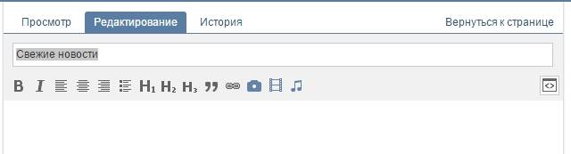
Well, here we come to the most interesting and at the same time difficult section. Perhaps there are people among the readers who do not know what wiki markup is and are hearing this term for the first time. Therefore, especially for you, I will give the definition that “Contact” itself gives.
Wiki markup is a markup language that is used to format text on websites (usually classified as wiki projects) and allows easier access to the capabilities of the HTML language. On our site, wiki pages are a good alternative to regular posts and text navigation. If you need to create a large article with different text formatting (bold, underlining, headings, etc.) or add graphics to it, or simply create a colorful navigation menu for your community, a wiki is indispensable.
Just like Wordpress (or any other CMS) has an HTML editor with which you create articles, Contact has its own editor for creating and editing wiki pages. It looks like this:

Using this editor, navigation menus are created, as well as articles with pictures, videos and audio recordings. Below I will discuss in detail how to work in this editor, but first I ask you to bookmark two links. They will help you a lot in learning wiki markup.